Redesigning Unity Finance:
Increased Analytics Engagement by 3x
User Find it Useful
0%
Overview & challenge
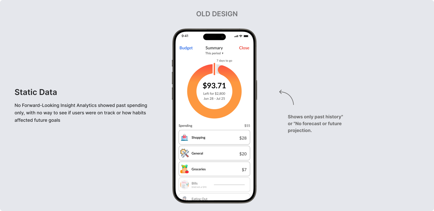
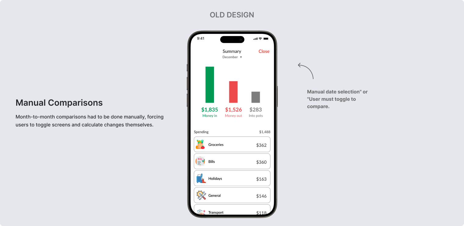
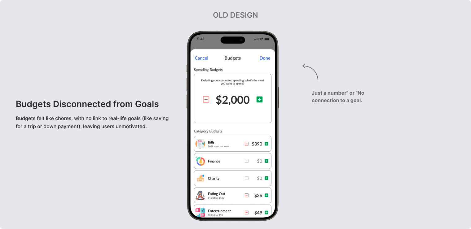
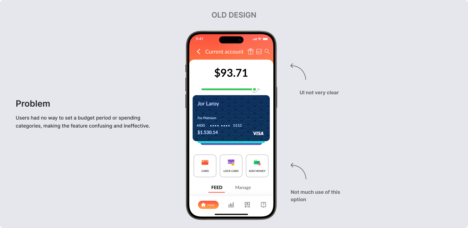
Unity Finance’s analytics dashboard had become a rarely-visited feature, with users spending just 15 seconds reviewing their spending before leaving. Users struggled to extract actionable insights from their financial data to improve their budgeting and savings goals.
I led a full redesign that introduced fresh branding and transformed analytics into a proactive, coach-like experience that guides users toward better financial decisions. The new design focuses on spending patterns, budget tracking, and personalized insights.
My role
Led end-to-end design from discovery through launch. Owned user research, information architecture, wireframes, visual design, and usability testing while collaborating with PM on requirements and dev team on technical feasibility.
Team
Collaborated with a Product Manager, Senior Developer, and Customer Support Head
Client
Unity Finance (via Upwork)
Timeline
8 Weeks
Tools of use
My Approach
Discovery
Stakeholder interviews, user research review
Problem Definition
Identifying core pain points and opportunities
Ideation
Concept development and design iterations
Validation
User testing and stakeholder feedback
Refinement & Delivery
Final designs and developer handoff
Outcomes
Measuring success and key takeaways
Discovery
As Unity Finance grew to over 12,000 users, one issue kept surfacing: the budgeting and analytics feature hadn’t changed in years. People could see where their money went, but they couldn’t use it to actually plan ahead. Frustration was building, and I set out to uncover why.
Key Problems Identified
Uncovering the “Why” & “How”
To validate the problems, I ran a focused 1-week research sprint involving stakeholder workshops, user interviews, and journey mapping to align business goals with user needs.
App Store Reviews
From
100+
reviews
30%
of critical feedback cited “unhelpful analytics” and “confusing budgets.
User Interviews
5
remote sessions revealed users felt anxious and unsure how to improve when viewing the stats page.
Support Tickets
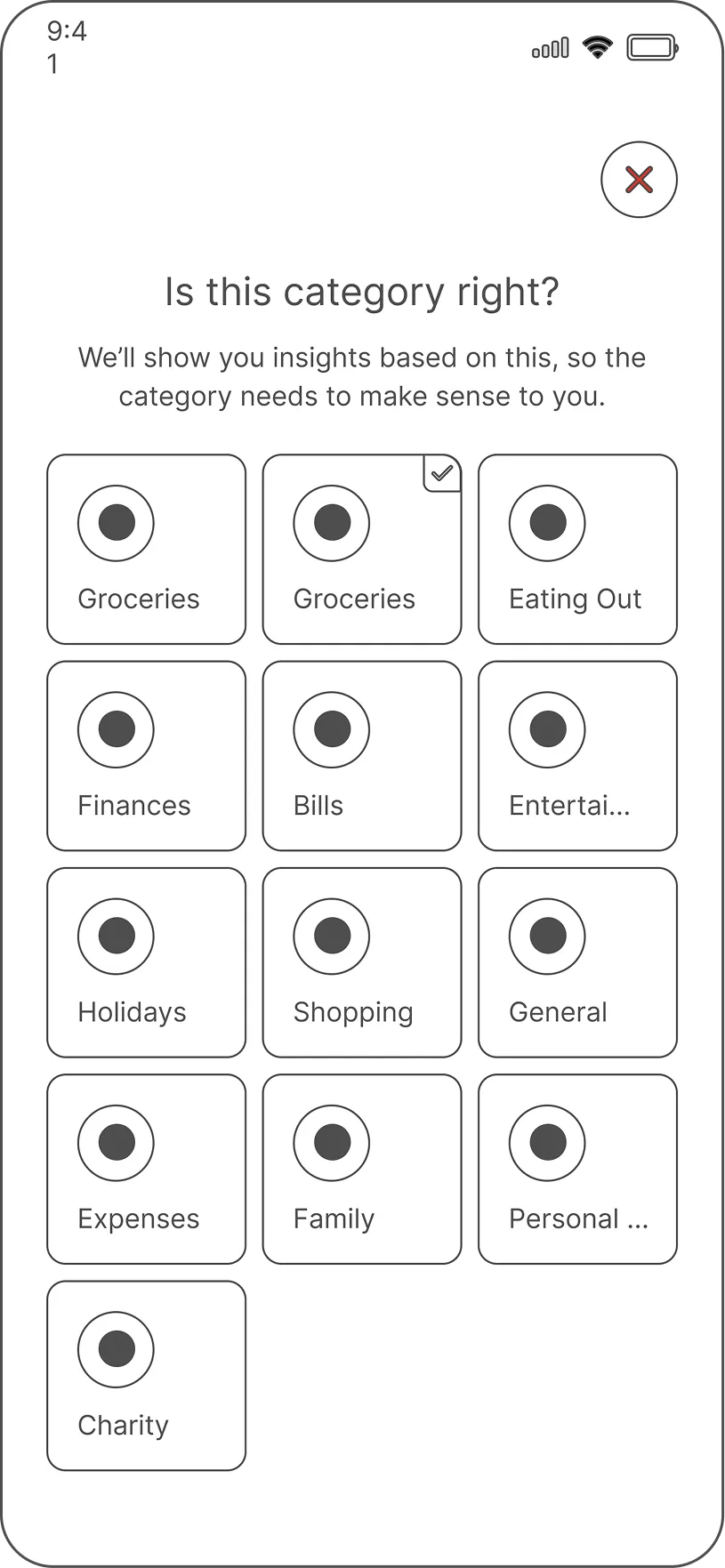
Partnering with the Support Lead uncovered a hidden root cause: transaction miscategorization eroded trust in analytics.
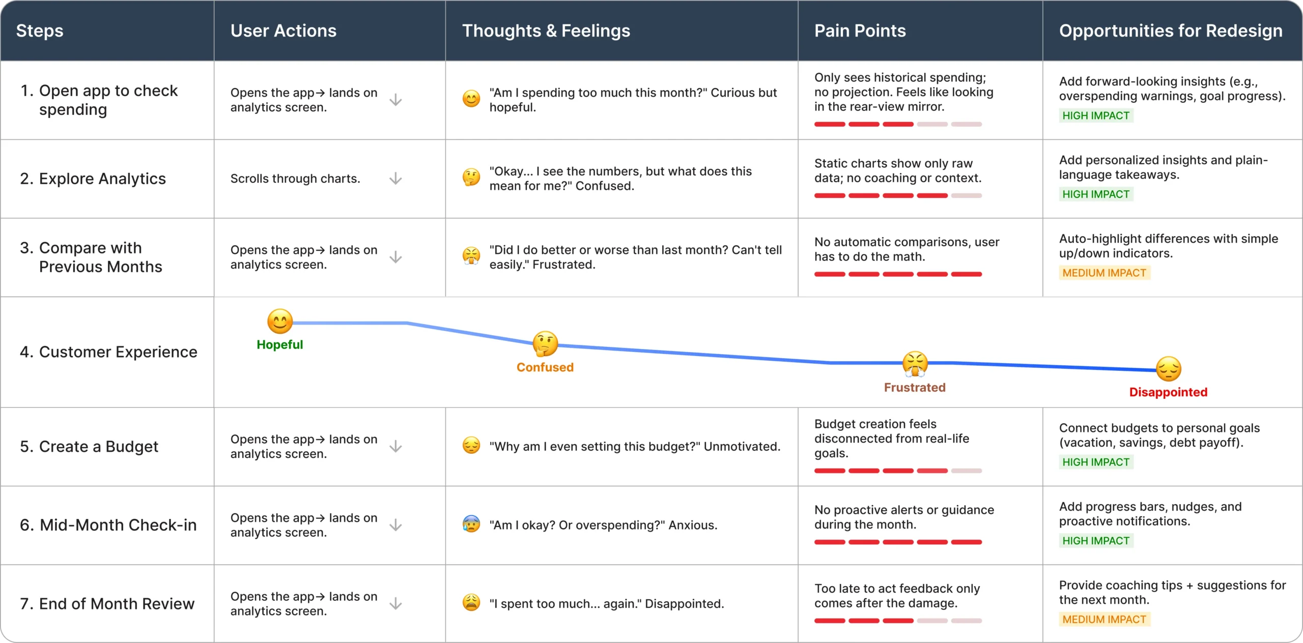
Customer Journey Map
I created a journey map to visualize the user’s experience, aligning the team on key pain points and opportunities.
Ideation & Iterations
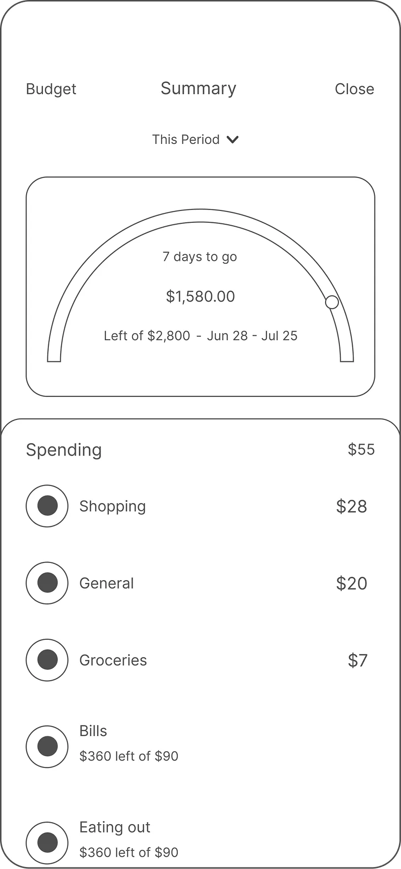
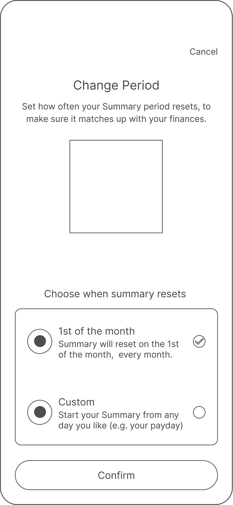
I tested these early wireframe concepts with users to test my ideas before committing to the final design. I needed to know what was intuitive and what was still confusing.
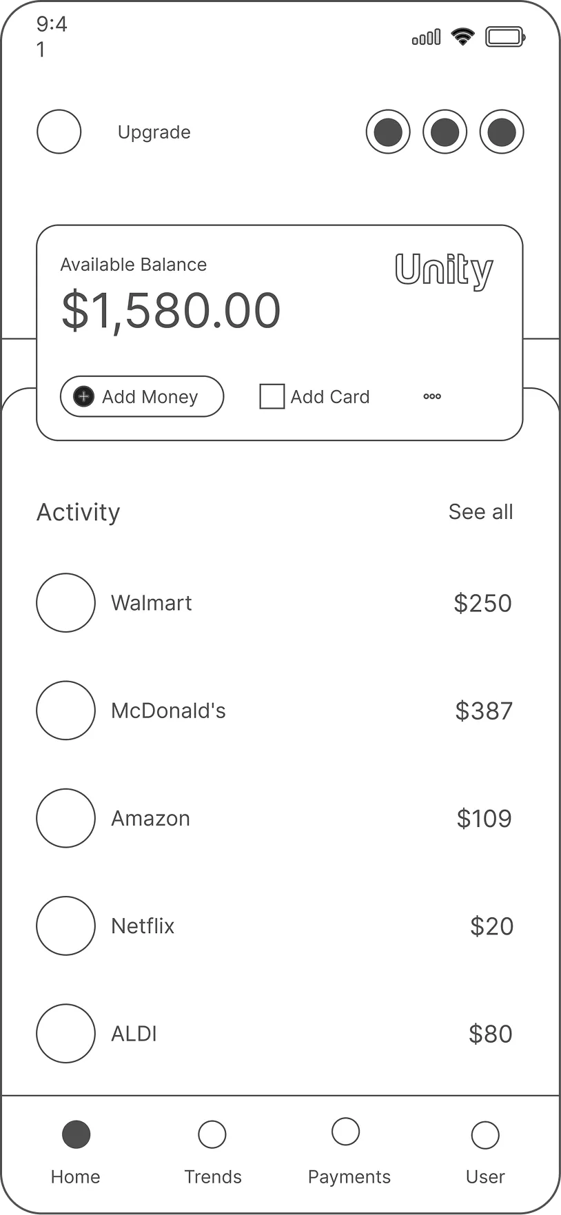
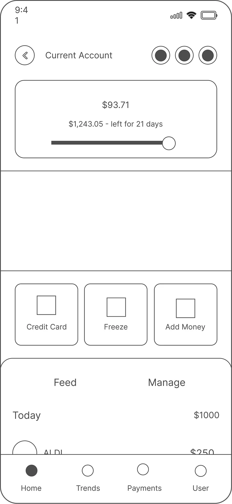
Wireframing
Testing Outcomes
80%
of users preferred the new Forecast Bar, praising its ability to show future spending risk upfront.
Monthly comparisons became
3x
faster with automated insights, eliminating manual work.
Users appreciated the clean visual hierarchy, noting it made financial summaries easier to scan and interpret at a glance.
What Needed Iteration
Some users felt overwhelmed by too many insights at once, requesting more control over alerts.
The “Insights” section wasn’t immediately discoverable users recommended clearer placement and labeling to make it easier to find
A few users wanted more context behind each metric, suggesting tooltips or explanations to build trust in data accuracy.
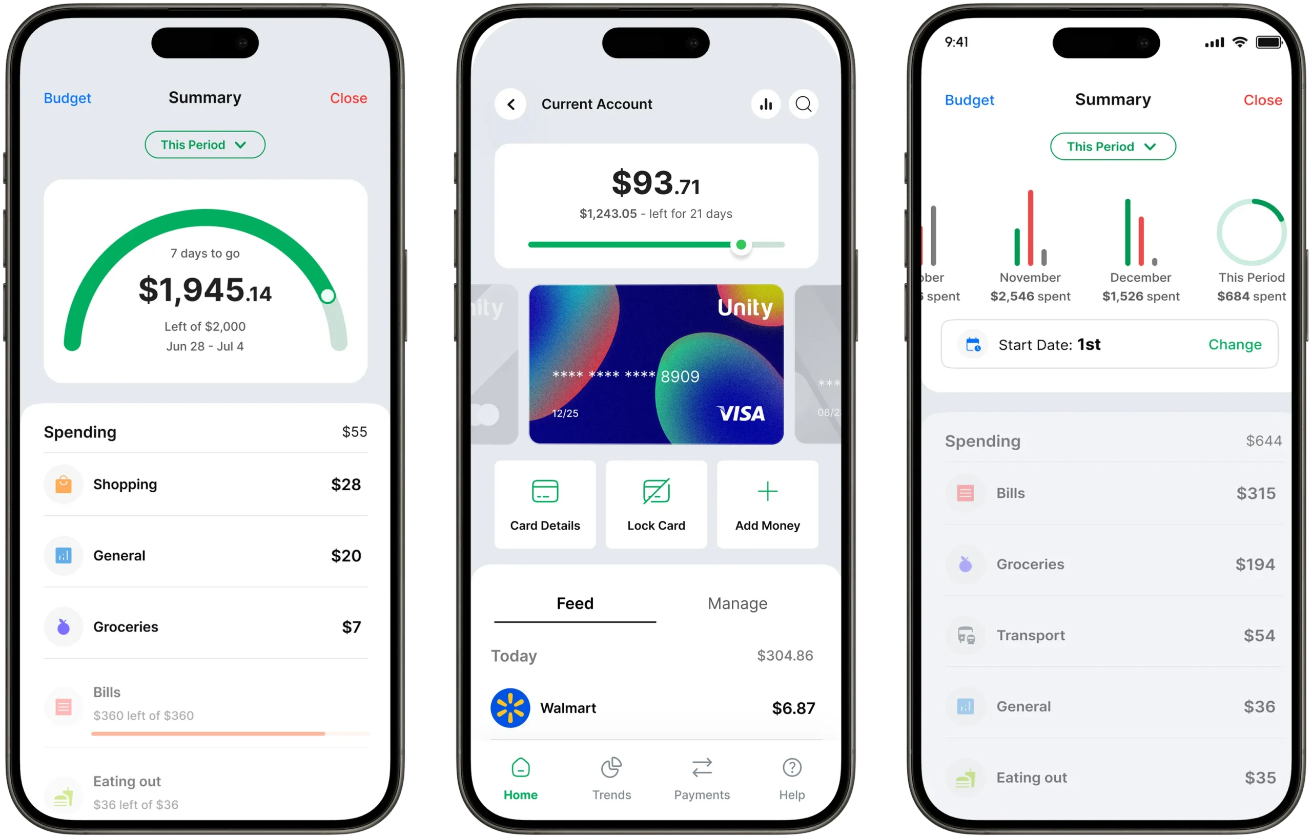
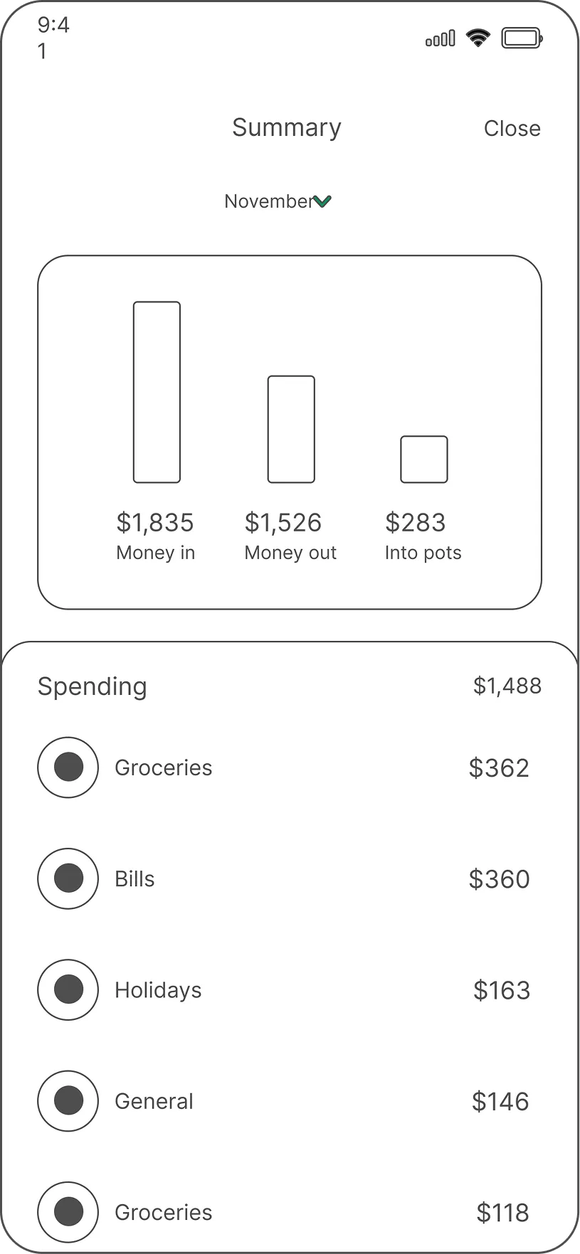
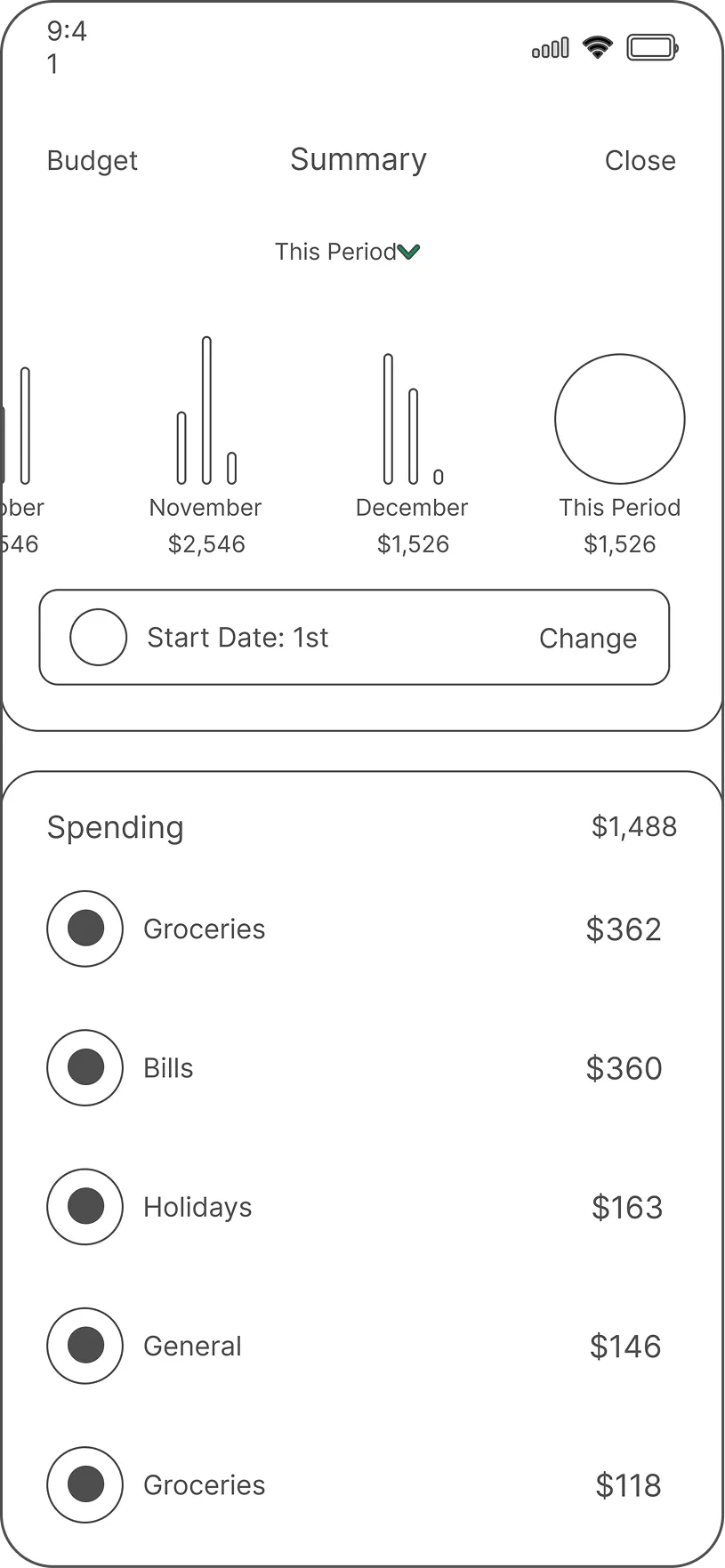
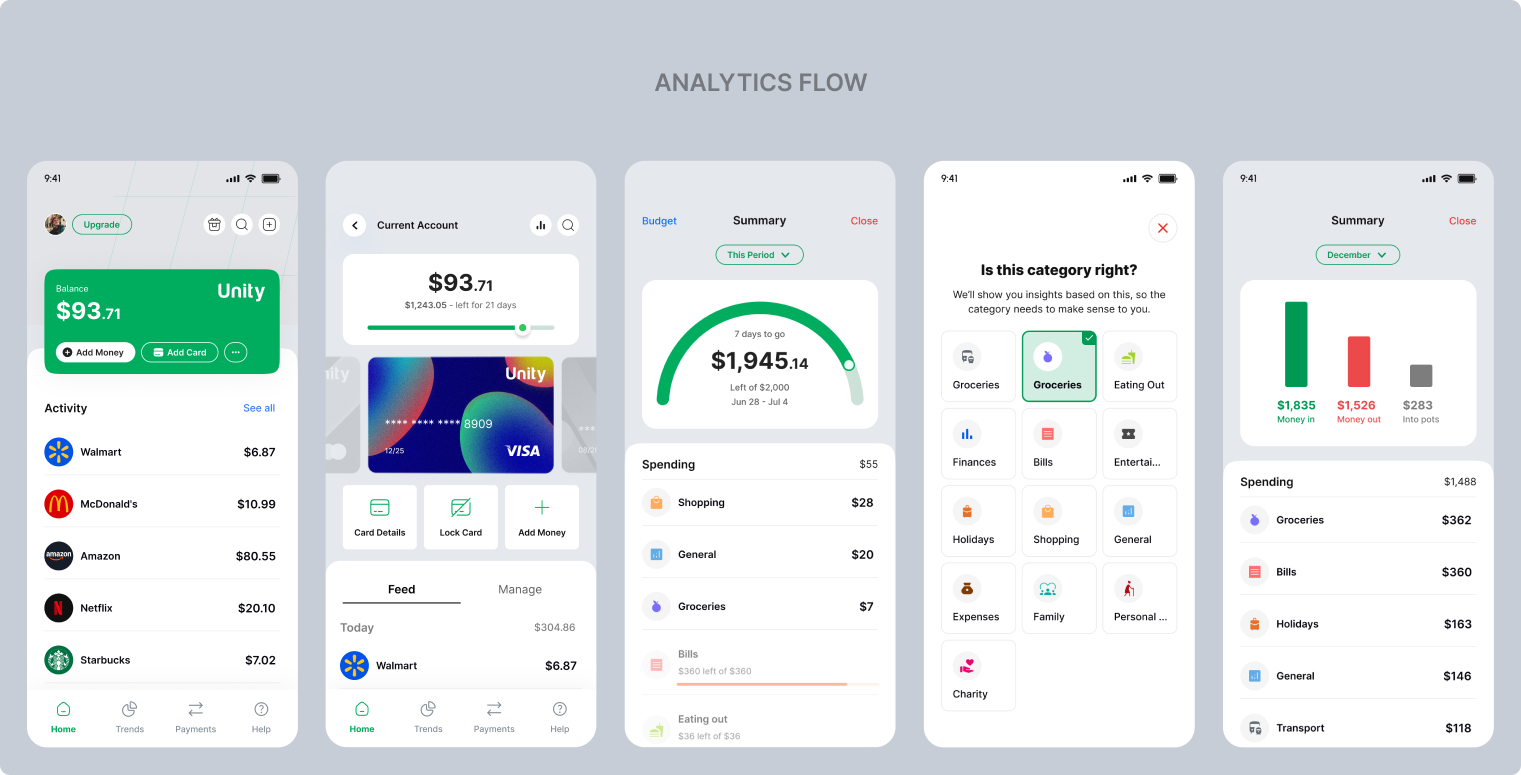
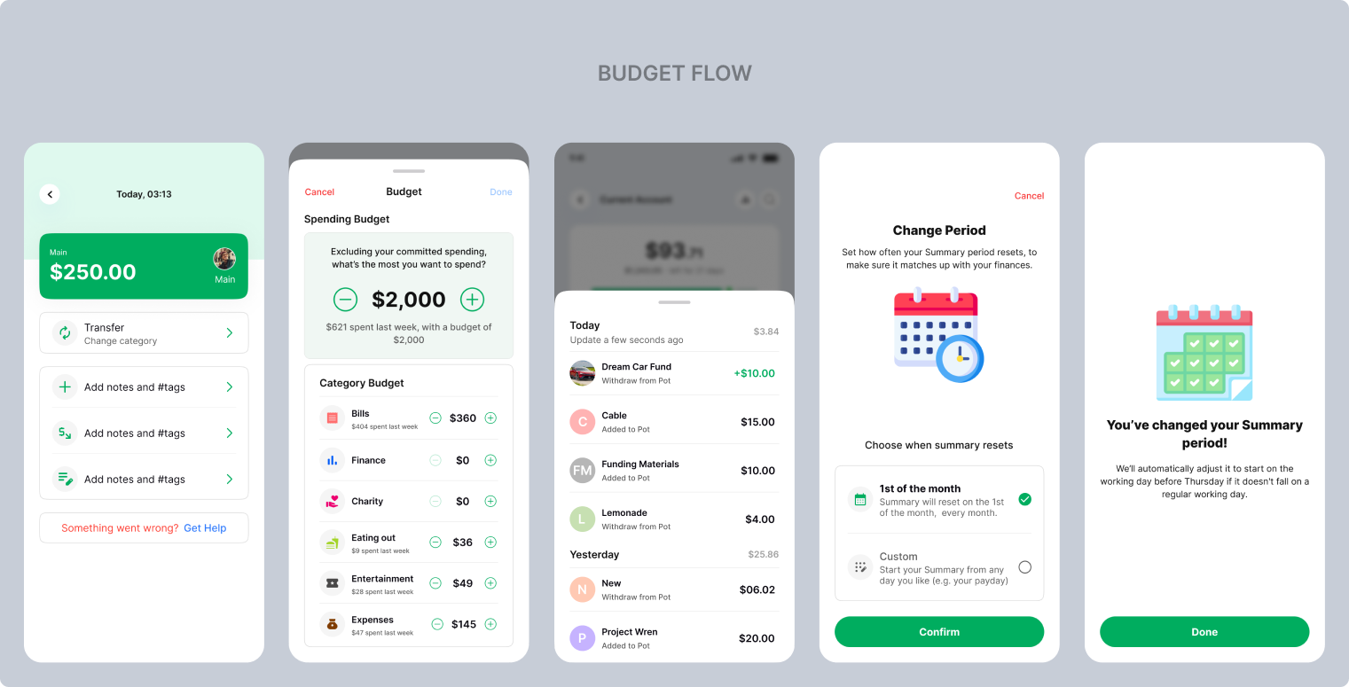
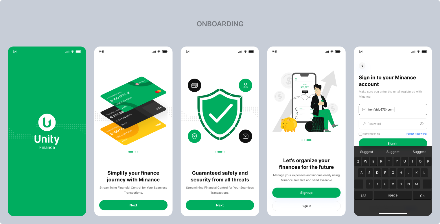
Final Design
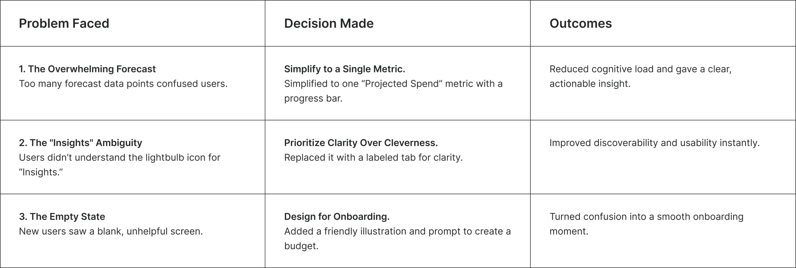
Problems Faced & Key Decisions
This phase wasn’t without its challenges. Navigating constraints and feedback was crucial to shipping a design that was not only user-friendly but also technically feasible and aligned with business goals.
The Outcomes
This phase wasn’t without its challenges. Navigating constraints and feedback was crucial to shipping a design that was not only user-friendly but also technically feasible and aligned with business goals.
3× increase in engagement (15s → 45s per session)
80% user preference over the previous design
2.5× more actions taken per session (savings goals set, budgets adjusted)
My Key Learnings:
Simplicity is powerful. The most effective solutions directly answer the user’s core question without unnecessary complexity.
Focus on the primary user goal. For this feature, that was answering: “Am I going to be okay?”
Clarity over cleverness. Using clear language and familiar patterns (like labeled tabs) is more effective than trying to be unique.
Great design is subtractive. It’s about removing obstacles and friction, not just adding new features.
Constraints foster innovation. Technical and user feedback constraints led to simpler, more creative solutions.
Test assumptions early. Validating concepts with low-fidelity prototypes saves time and ensures you’re building the right thing.