Redesigned Shoppable UGC Widget to Boost E-Commerce Sales and Engagement
sales growth for UGC module
0%
fewer support tickets
0%
Overview & challenge
Nosto’s shoppable UGC widget is a core feature that lets e-commerce brands curate content from 27+ social platforms, tag products, and publish it across websites, emails, and campaigns. For many brands, it’s the bridge between social proof and sales. The original widget, however, had complex templates, scattered settings, and unclear customization, leading to confusion, limited adoption, and a high number of support tickets. I redesigned the widget by simplifying templates, streamlining settings, and improving the publishing flow.
My role
I led this project end-to-end over 12 sprints (24 weeks), from problem discovery and user research to final execution and launch. My role included running stakeholder workshops, conducting user interviews, prototyping solutions, and validating concepts through usability testing.
Team
Design: Myself (Product Designer, lead on this project)
Engineering: 2 Frontend Dev, 1 Full Stack Dev (implementation & technical feedback)
Support/Success: 2 Customer Success Manager (insights from support tickets)
Tools of use
‘‘Widget is not working properly, we need investigate and fix it’’
Head of product
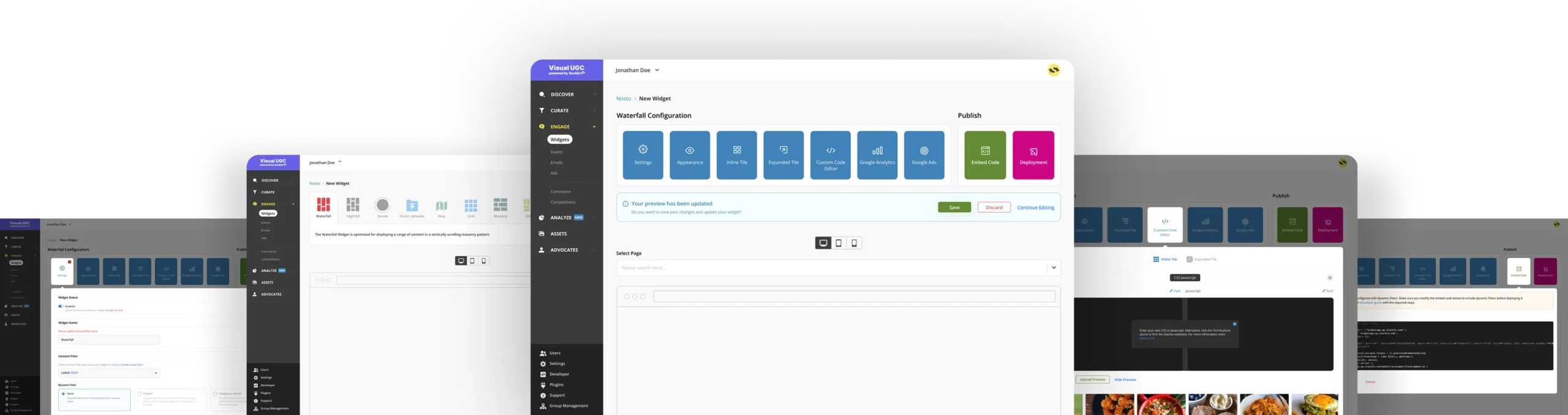
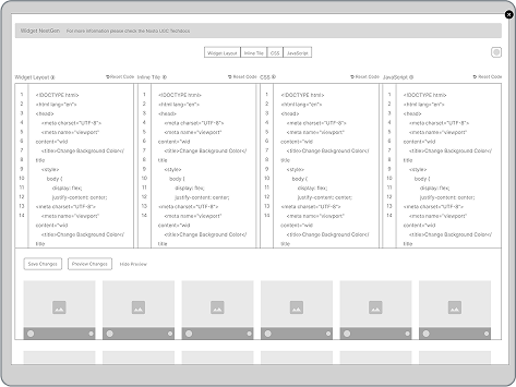
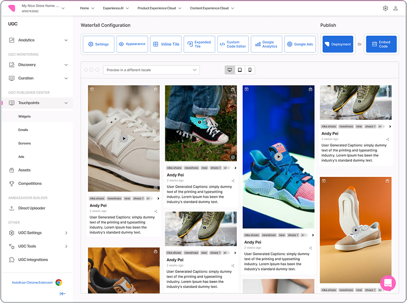
Old Design
My Approach
Understand the problem
Research &
Discover
Define the Problem & Goals
Ideation & Exploration
Testing
Design & Delivery
Outcomes
1. Understand the Problem
I talked with stakeholders (Head of Product, PM, Support, Sales) to align on business goals. Using initial feedback that pointed to several initial problems, I also defined our initial goal.
Low retention due to confusing setup and costly customizations
Brand and compliance risks from outdated design
Losing market share to more modern competitors
Goal
Find bugs and fix them with UI update
Improve guidance and education
Competitive feature enhancements
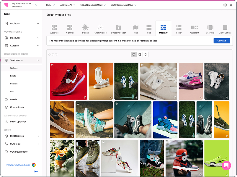
New design template
Redesign components where needed
2. Research & Discover
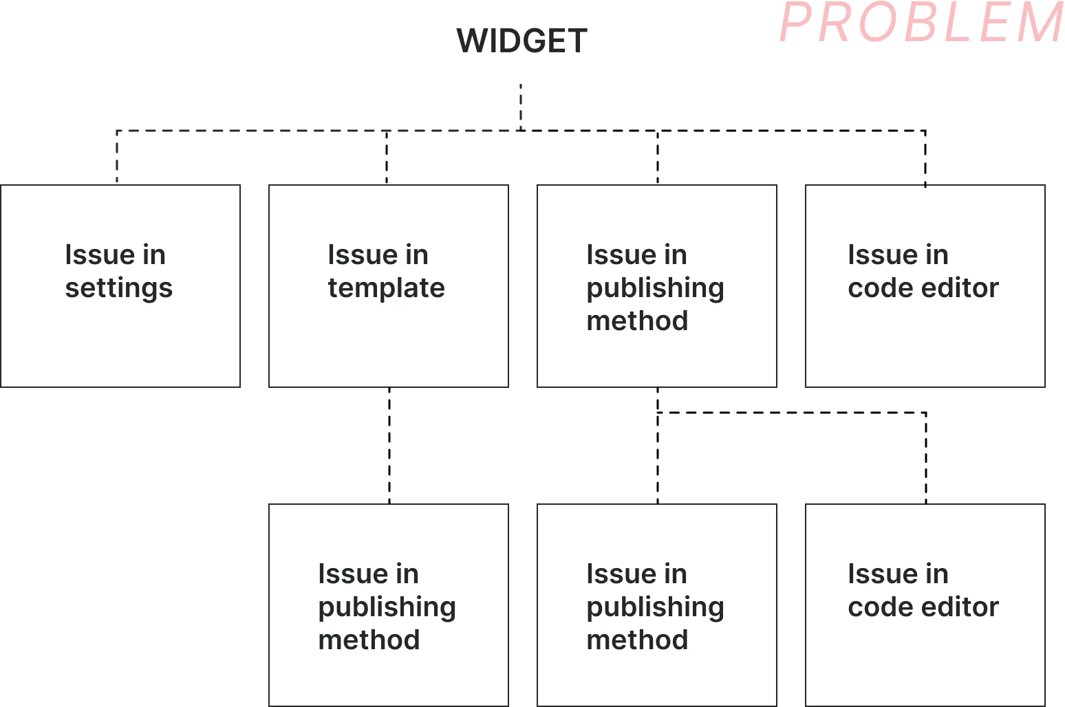
For research I broke down the larger widget problem into smaller issues to identify the specific areas causing friction
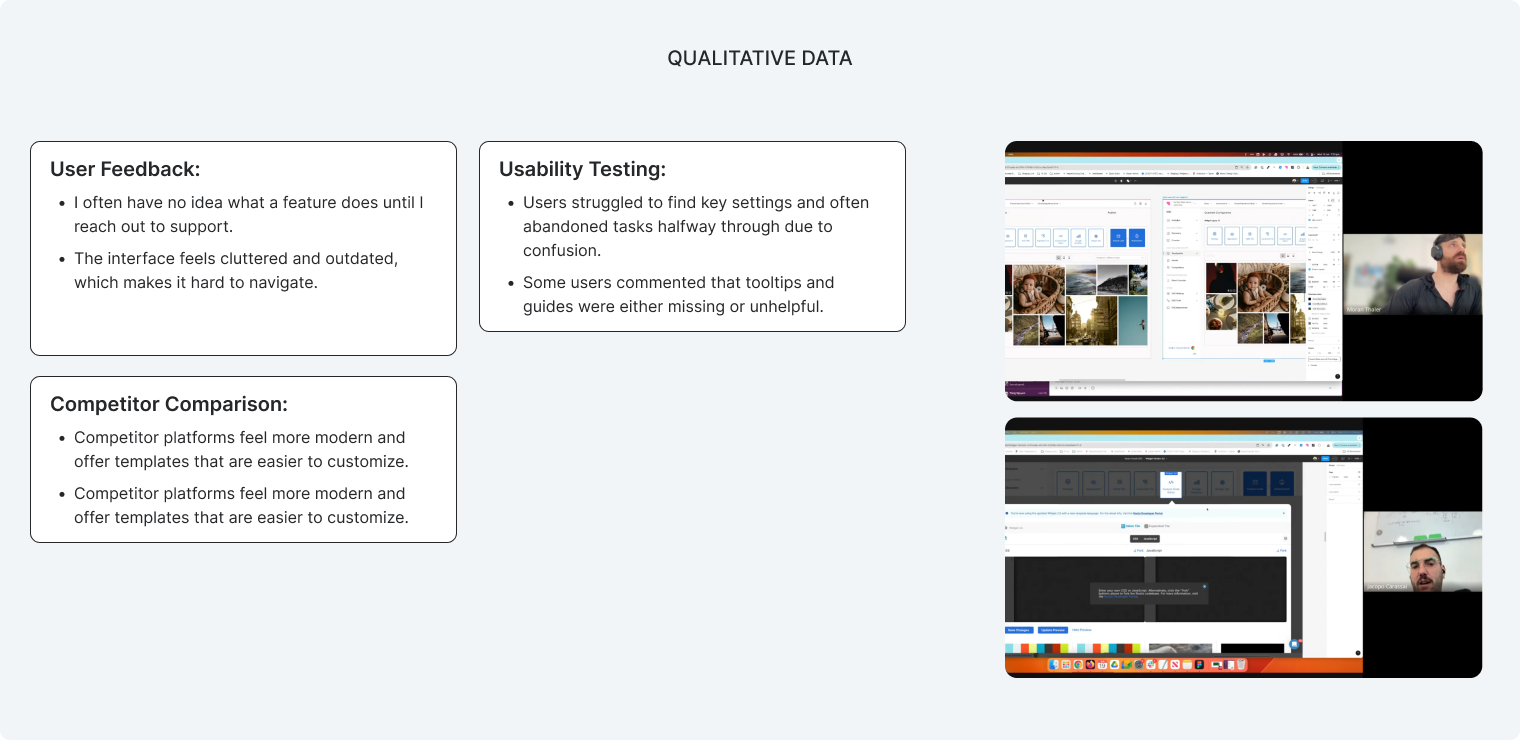
I conducted foundational UX research, including user interviews, usability testing, and stakeholder discussions, to gather insights and validate key pain points within the existing feature.
‘’I realized that quick fixes wouldn’t solve the problem, so I went beyond the initial request and conducted deeper research’’
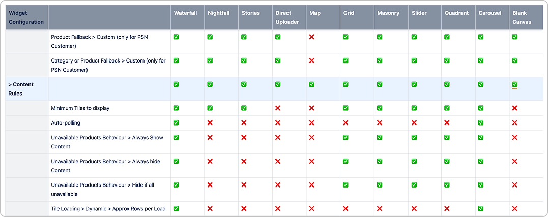
Audit
I conducted a thorough audit of all 280+ existing settings to evaluate performance, identify usability issues, and uncover areas for improvement based on user behaviour, support data, and technical limitations.
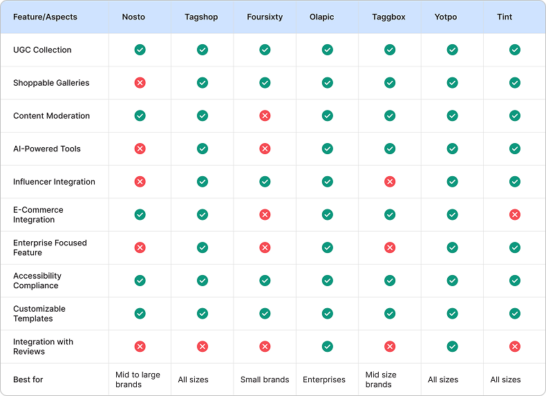
Competitor Analysis
I conducted a competitive analysis of various UGC providers to identify their strengths and weaknesses, helping determine which platforms offer the most relevant features for different business needs.
Research Findings
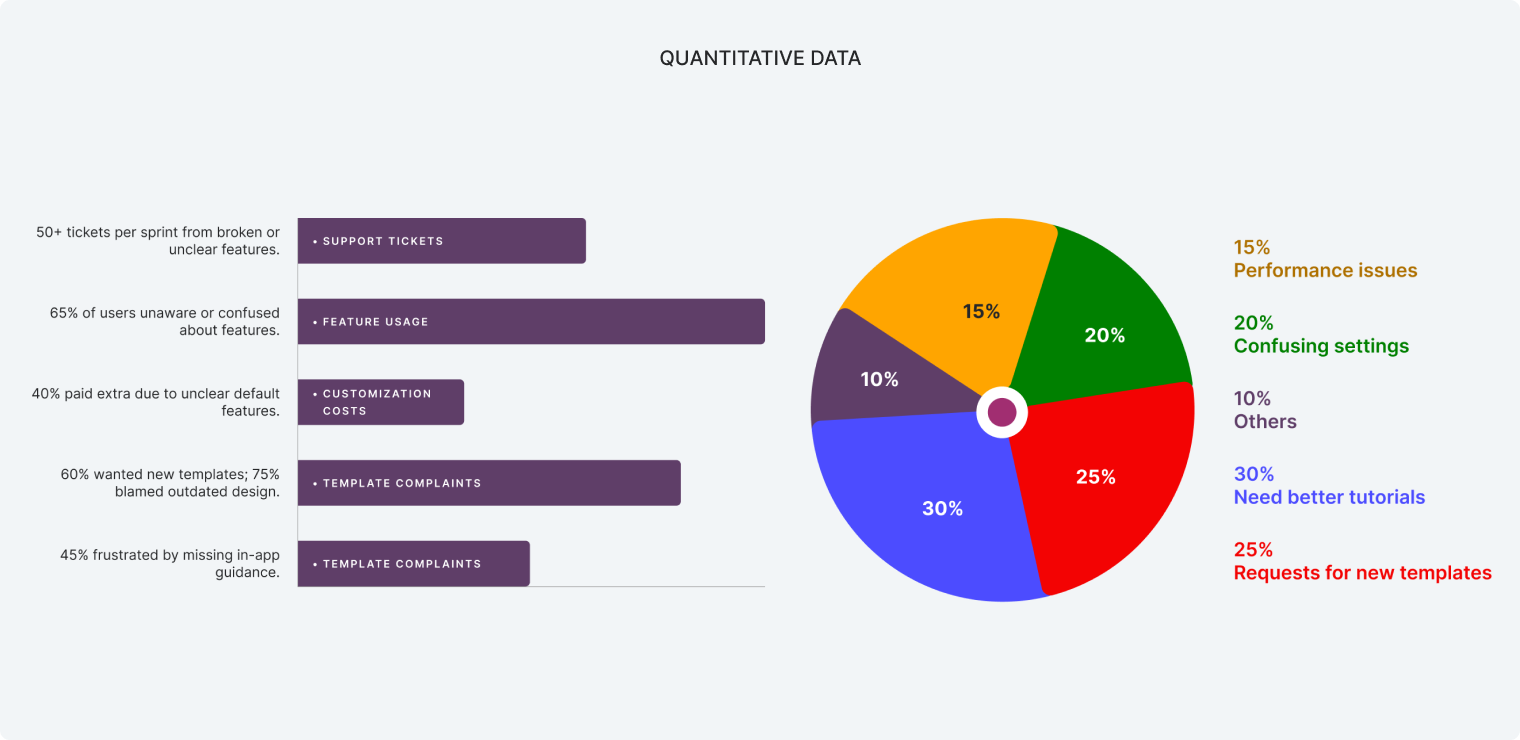
High User Drop-Off:
40% of users abandoned the widget creation process due to its overwhelming complexity and unclear value proposition.
Inconsistent Behavior:
55% of reported issues stemmed from unpredictable settings where changes failed to apply, eroding trust and forcing users into frustrating workarounds.
Widespread Feature Confusion:
65% of users were unaware of or could not find key features because settings were illogically organized and poorly labeled.
Mobile Reliability Failures:
30% of widget views on mobile and tablet devices broke or displayed incorrectly, directly impacting a critical channel for e-commerce sales.
Significant Support Overhead:
50+ The confusing UI and broken functionality generated 50+ support tickets per sprint, straining internal resources.
Research Findings
High User Drop-Off:
40% of users abandoned the widget creation process due to its overwhelming complexity and unclear value proposition.
Inconsistent Behavior:
55% of reported issues stemmed from unpredictable settings where changes failed to apply, eroding trust and forcing users into frustrating workarounds.
Widespread Feature Confusion:
65% of users were unaware of or could not find key features because settings were illogically organized and poorly labeled.
Mobile Reliability Failures:
30% of widget views on mobile and tablet devices broke or displayed incorrectly, directly impacting a critical channel for e-commerce sales.
Significant Support Overhead:
50+ The confusing UI and broken functionality generated 50+ support tickets per sprint, straining internal resources.
3. Define the Problem & Goals
The Core Problem
E-commerce marketers need to quickly and confidently publish social proof to boost conversions, but are thwarted by a widget builder that is complex, unreliable, and poorly documented. This is leading to stalled campaigns, a high volume of support tickets, and lost revenue for both our clients and Nosto
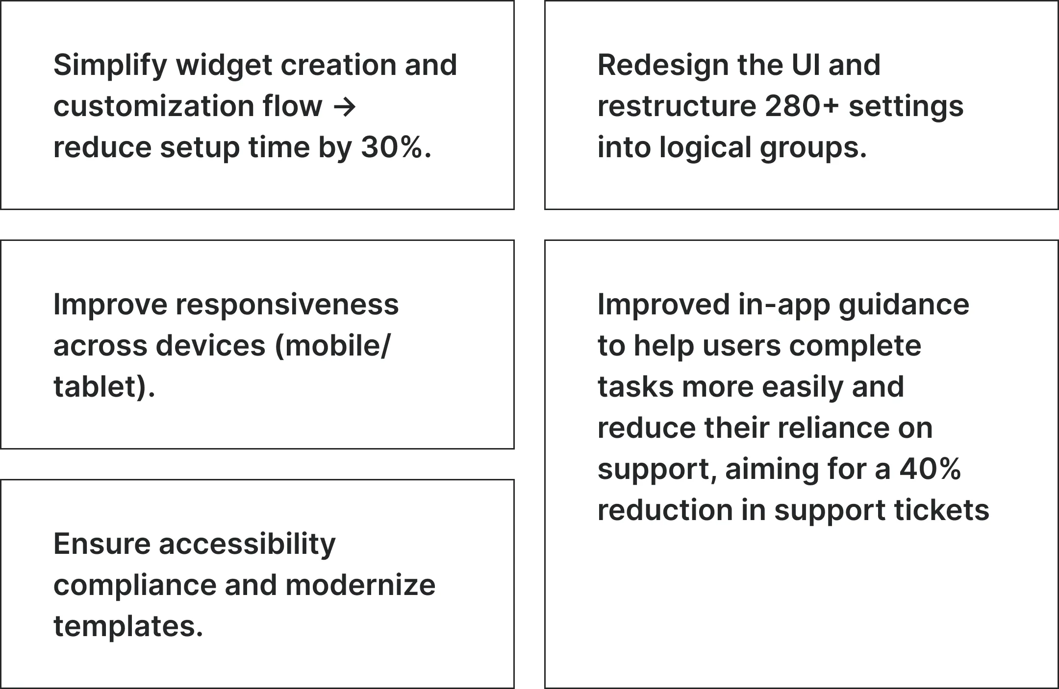
The Refined, Measurable Goals
4. Ideation & Exploration
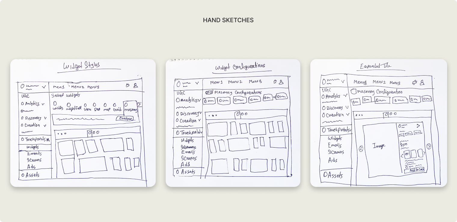
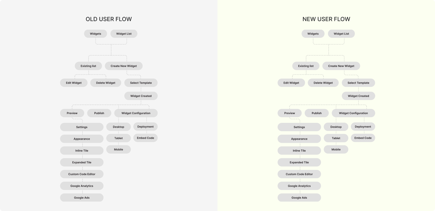
Brainstormed ideas, sketched early concepts, and worked with the team to map and refine the user flow aligning on the best solution to move forward
5. Wireframe & Testing with User
User Testing
Customers
Positive:
Found the flow intuitive and easy to follow.
Loved the working mobile/web preview feature.
Naming step felt organised and helpful.
Editing widgets felt quicker compared to previous versions.
Issues:
Too many settings shown at once, felt overwhelming.
Needed tooltips or guidance for some options.
Customer Success Manager
Positive:
Flow is logical and customer-friendly.
Likely to reduce support requests for small changes.
Dual preview is a strong selling point.
Easier to train new clients on this version.
Liked the modular structure of the customisation steps
Issues:
Too many settings shown at once, felt overwhelming.
Needed tooltips or guidance for some options.
Issues:
Onboarding or guided walkthroughs needed.
Some settings felt too limited for advanced users.
Suggested adding quick feedback inside the editor.
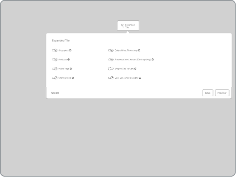
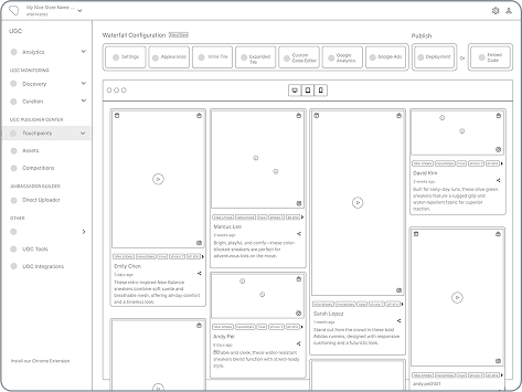
4. Design & Delivery
Created the final designs, shared prototypes and notes, and ran kickoff sessions to get everyone on the same page
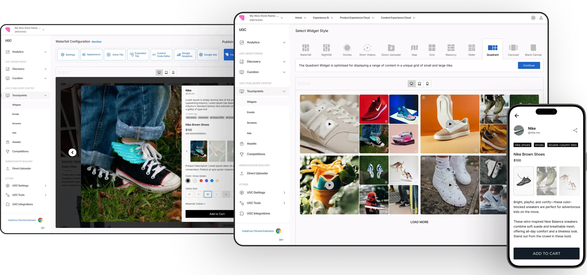
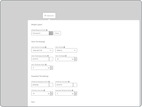
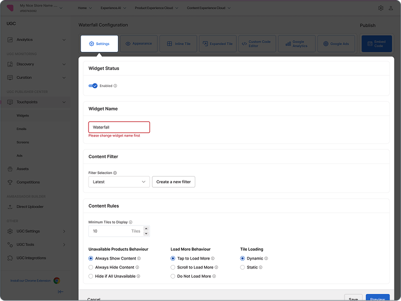
Final Design
7. Outcomes
Lift in Sales
0%
E-commerce brands saw more purchases from shoppable UGC in the first 3 months
Retention Rate Boost
0%
More existing customers continued using the widget after the update
Average Savings per Brand
$0k
Reduced setup time and support needs
per widget publishing
Key Challenges & Decisions
Pivot to Full Redesign – Task abandonment was 42%, so we committed to a complete redesign based on user pain points.
Tight Timelines & Resources – Adopted a modular rollout approach, shipping high-impact features first and delivering updates 30% faster.
Template Prioritization – Focused on the 2 templates driving 80% of usage, reallocating 120+ dev hours to high-ROI features.
Remote Collaboration – Used Loom videos + detailed notes to bridge time zone gaps, cutting clarification requests by 50%.
Learnings
Learned to simplify complex, multi-step workflows into clear, user-friendly experiences.
Discovered hidden pain points through real customer testing.
Saw how small, feedback-driven iterations create better outcomes than assumptions.
Understood the value of aligning design decisions with business and engineering needs.